


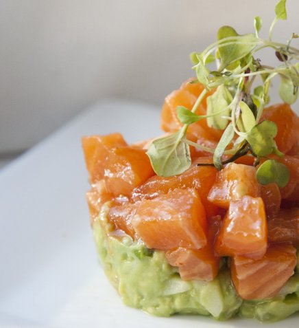
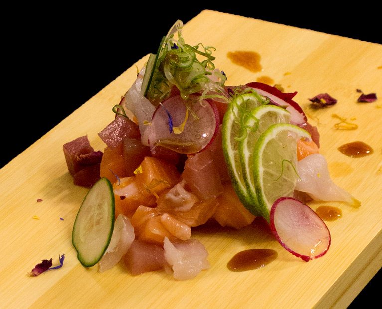
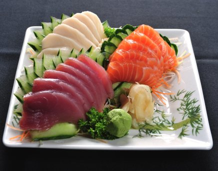
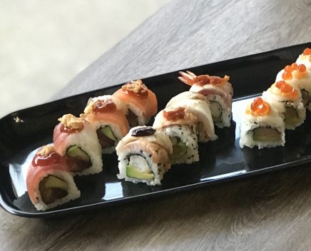
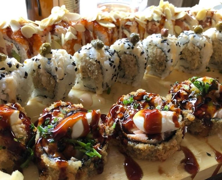
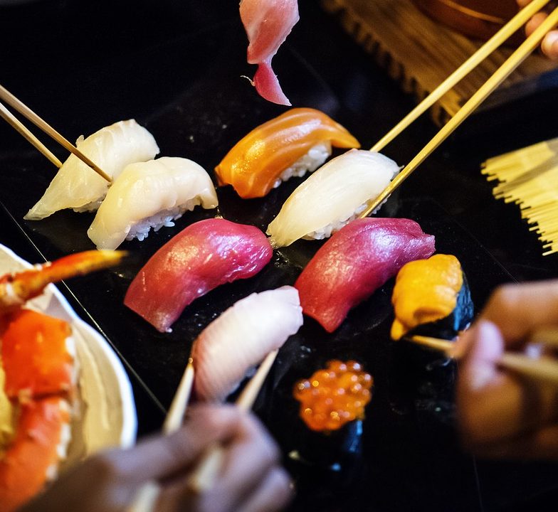
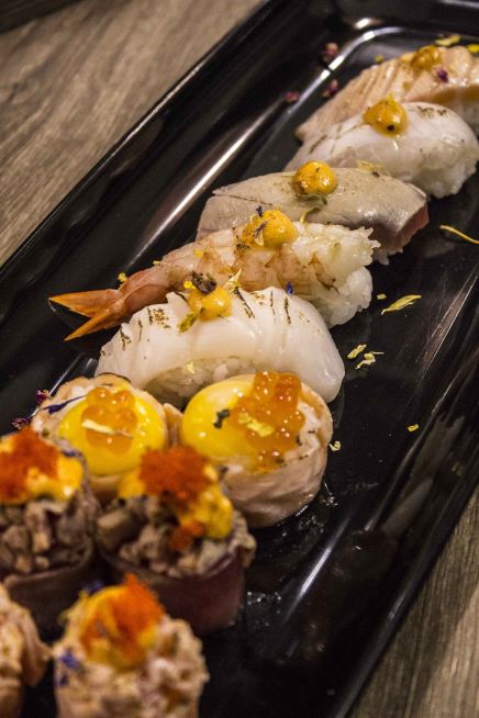
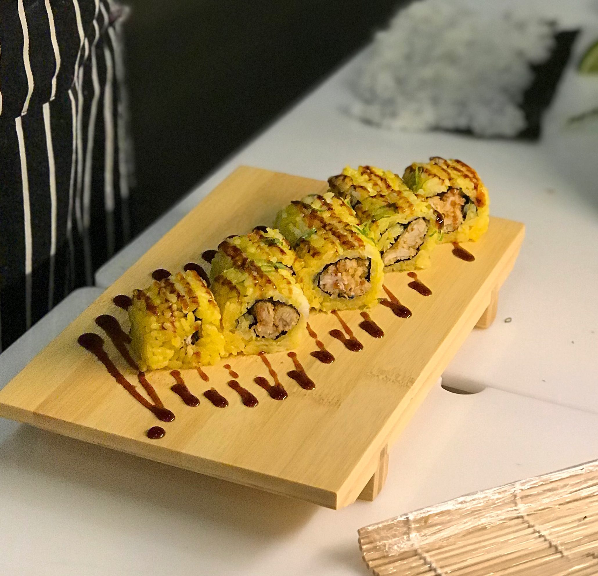
Stanco del solito All You Can Eat?
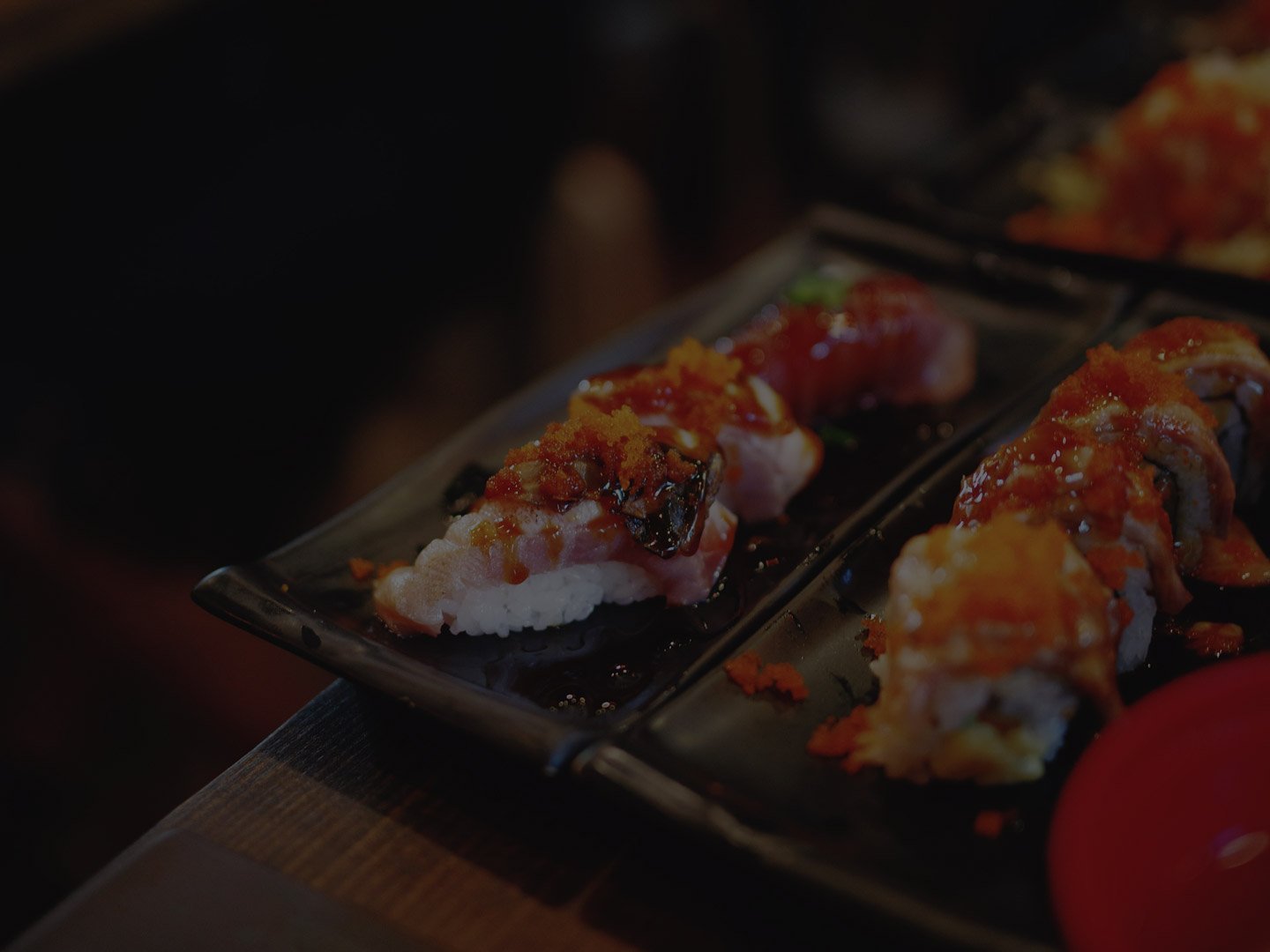
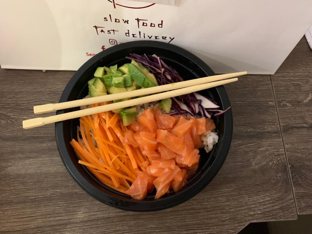
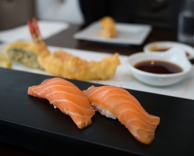
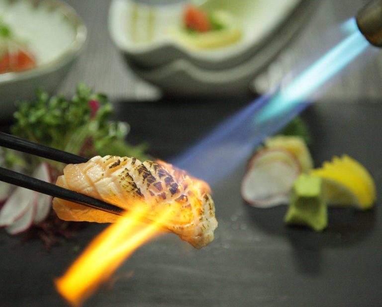
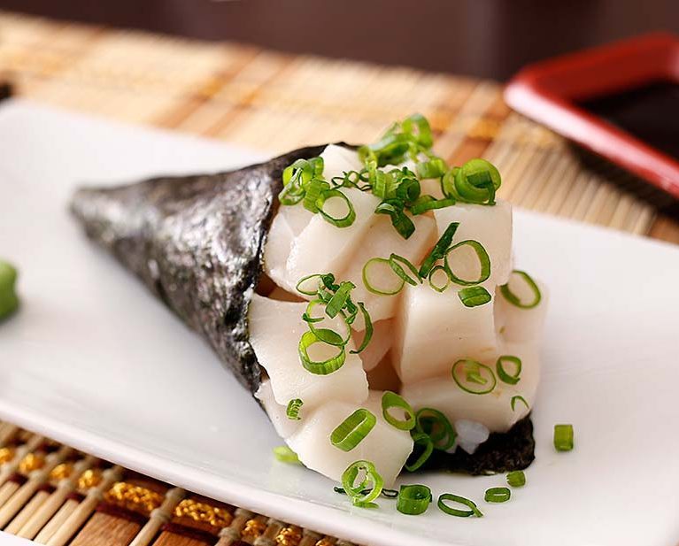
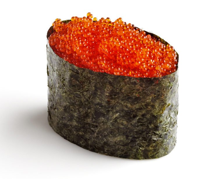
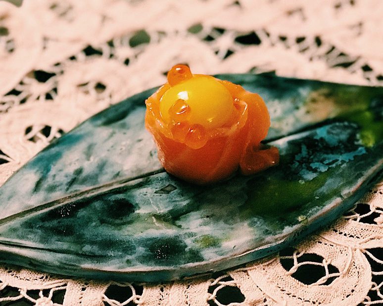
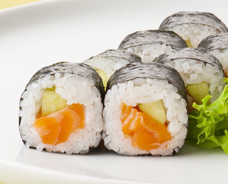
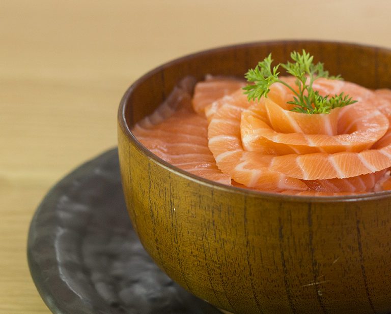
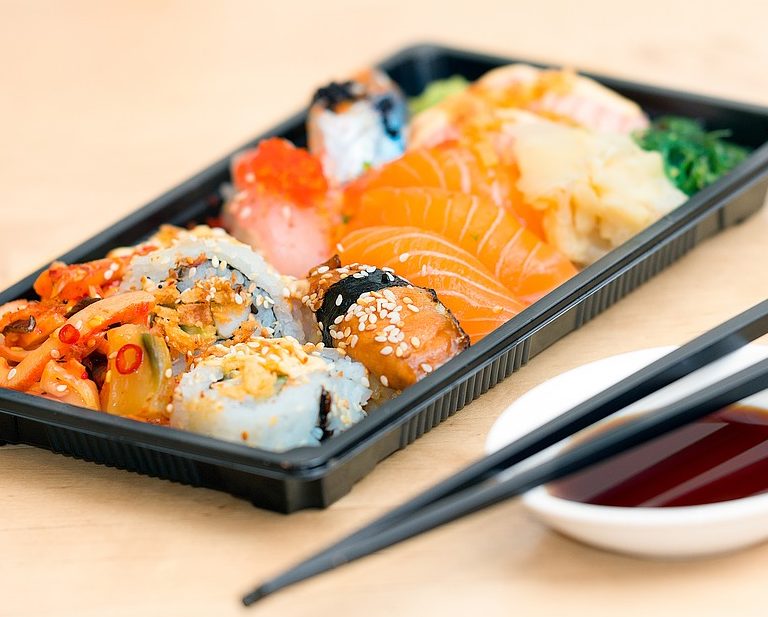
Sushi take away o consegna a domicilio.
La vera cucina Giapponese di qualità arriva a Novate Milanese, da noi o comodamente a casa vostra.
In quali comuni/quartieri consegniamo?
Novate Milanese – Bollate – Baranzate – Cormano – Bresso – Bovisa – Comasina – Quarto Oggiaro – Affori – Bruzzano – Arese – Cusano Milanino – Paderno Dugnano – Pero
1. Ordina dalla App
Ordina quello che vuoi mangiare comodamente dalla nostra app
Pagamento veloce
2. Paga in maniera semplice e veloce direttamente con il tuo smartphone (PayPal, Visa, Carte di credito).
3. Ricevi a casa il tuo ordine
Ricevi a casa tua il tuo ordine e gustati la nostra cucina giapponese di qualità
Le nostre offerte

10% di sconto
- Se l'ordine viene effettuato dalla nostra App
La consegna diventa gratuita
- per gli ordini che superano i 30 euro.
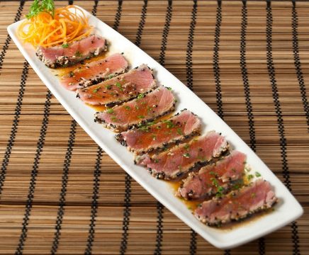
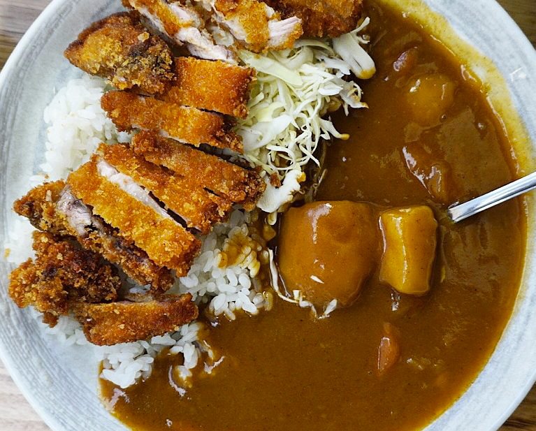
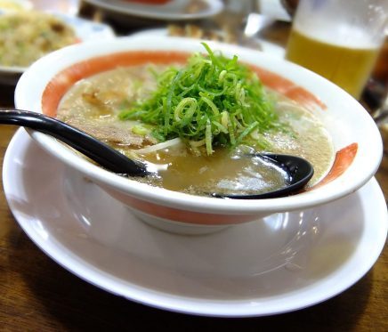
Ukiyo Sushi si presenta!
Un breve video per riassumere cosa vi offriamo 🙂
Scarica la nostra App
Menu sempre sottomano, ordini e pagamento più veloci, sia per iOS che per Android

